Olympikus
An energetic motion language for Brazil’s largest sports brand.
Olympikus has been innovating and developing athletic footwear and apparel since in 1975. The brand pioneers innovative technologies that transform the industry, merging unmatched performance, comfort, and affordability.
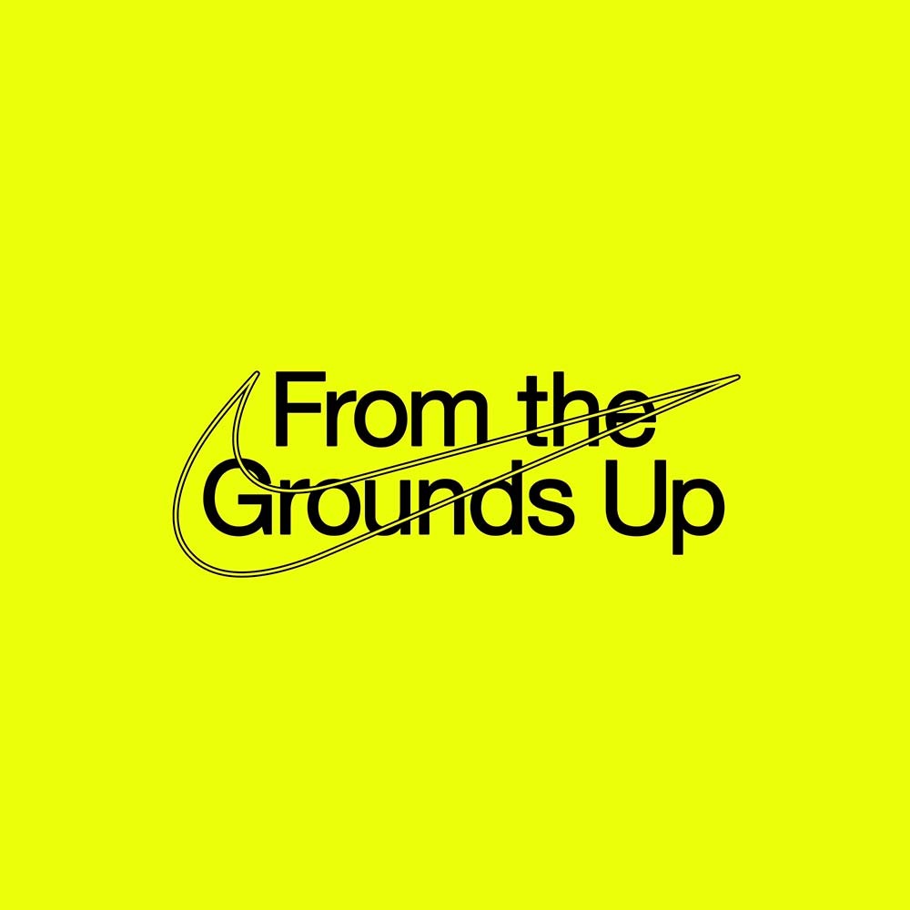
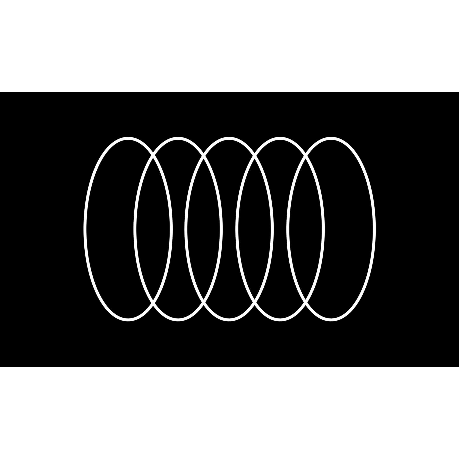
"The identity comes together through a modular system inspired by the stripes and geometry typically found in running tracks and sports flags. The system is robust and flexible enough to adapt to all of the brand's touch points including retail, packaging, e-commerce, product and everything in between. The modules can rearrange in a myriad of formats to contain the different brand elements including imagery, video and illustration."
Read more at Porto Rocha's website here.
Olympikus
An energetic motion language for Brazil’s largest sports brand.
Olympikus has been innovating and developing athletic footwear and apparel since in 1975. The brand pioneers innovative technologies that transform the industry, merging unmatched performance, comfort, and affordability.
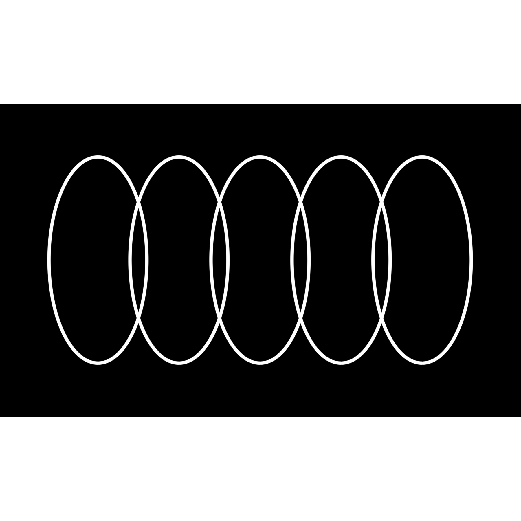
"The identity comes together through a modular system inspired by the stripes and geometry typically found in running tracks and sports flags. The system is robust and flexible enough to adapt to all of the brand's touch points including retail, packaging, e-commerce, product and everything in between. The modules can rearrange in a myriad of formats to contain the different brand elements including imagery, video and illustration."
Read more at Porto Rocha's website here.
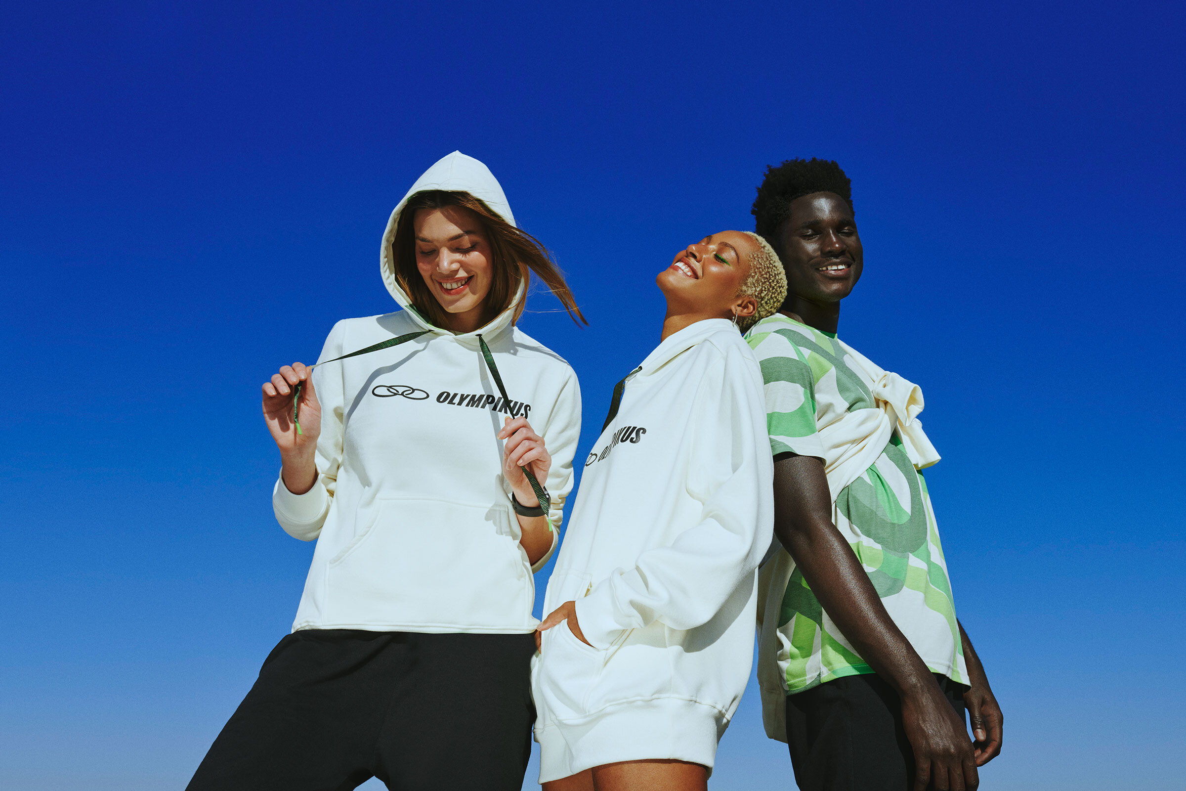
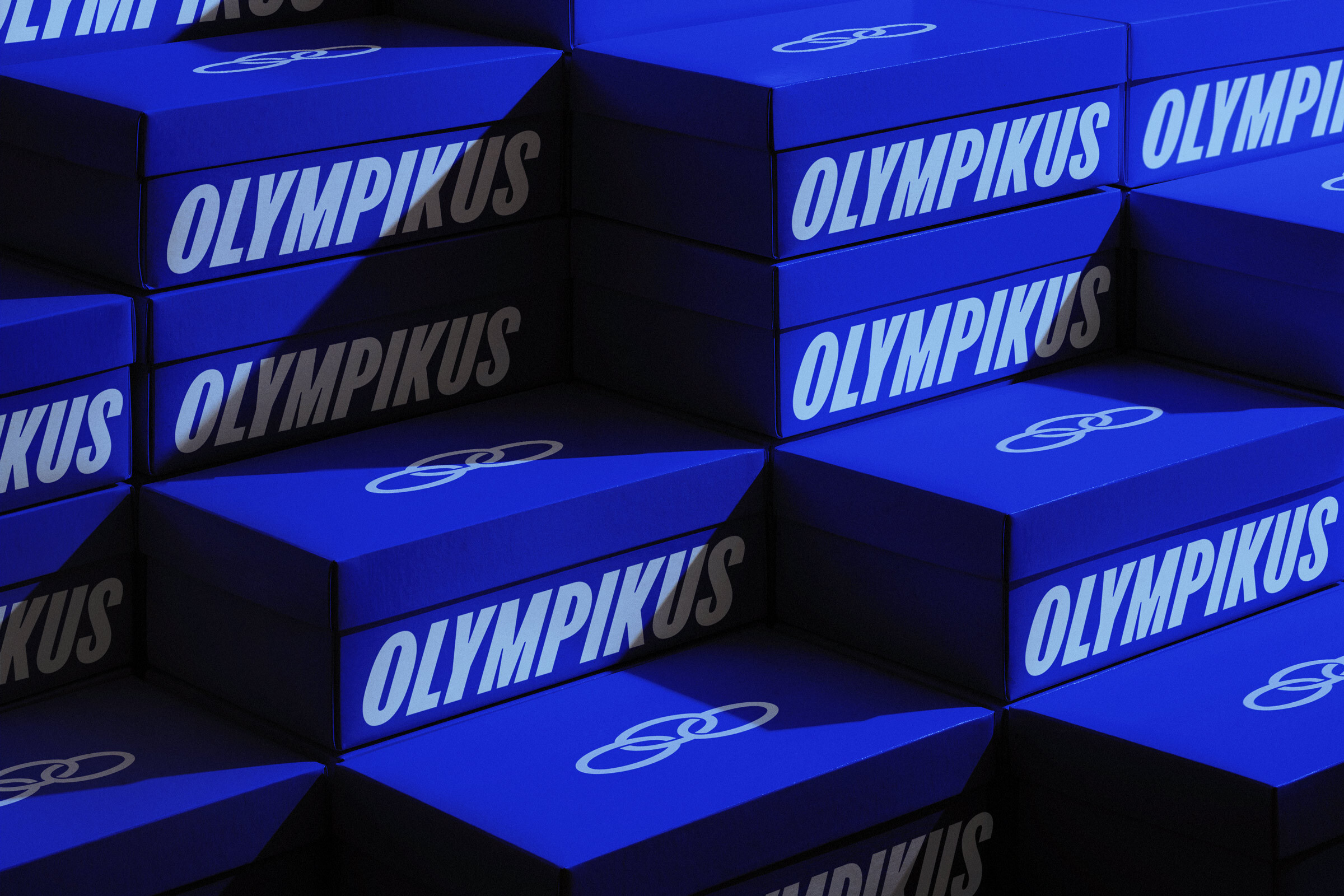
The motion language adapts the modularity of the layout system into one inseparable idea, where simple and direct compositions become flexible, allowing for all of the brand expressions to coexist.
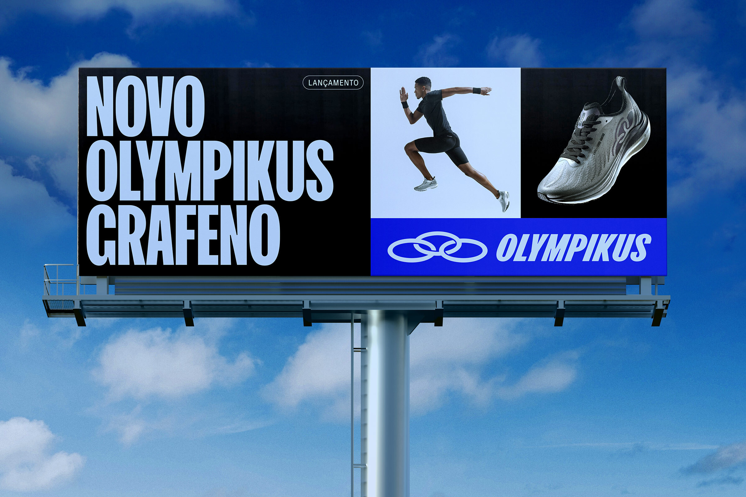
The new identity uses a bold new customized typeface, FK Olympikus, developed by Florian Karsten.
Inspired by the form of the logo, the rings take on new life as technical and energetic expressions, working together with the new typeface.


A range of kinetic illustrations were developed to communicate an array of qualities, like; performance, athleticism, technology and materiality.
Credits
Creative Direction: Leo Porto, Felipe Rocha
Design: Martin Taylor, Fionn Breen, Maricruz Meza, Luis Vazquez, Leo Porto, Felipe Rocha
Motion Design: Fionn Breen, Thales Muniz, Pedro Veneziano
Interactive Design: Marcos Rodrigues, Martin Taylor
Project Management: Nicholas Schröder, Elisa Bortolini
Tone of Voice & Copywriting: Katiane Romero and Murilo Fonseca
Typography Design: Florian Karsten
Case Study Photography: Mari Juliano
Case Study Production: Annie Carmichael
3D Design: Vinicius Lavor, Pedro Veneziano
Strategy & Creative Consulting: Yöne
Campaign:
Photography: Fred Othero
Artistic Creative Direction Lisa Ho
Casting: Lisa Ho
Retouching RG Imagem
Styling: Thais Barakat
Beauty: Bruna Pezzino
Product Photography: Xico Buny, João Bertholini
Retouching: Rodolfo Pestana
Olympikus: Marcio Callage, Katia Ribeiro Buriol, Luciana Pires, Tamiris Lopes de Souza, Queli da Luz Forgiarini